Bank by Appointment
The Challenge
Bank of America faced a critical hurdle in its customer service: an outdated and cumbersome appointment scheduling tool. This legacy system was not just a minor inconvenience; it was actively impeding customer engagement and negatively impacting sales.
I was brought in to tackle this challenge: to modernize the tool within an ambitious eight-week timeline, ensuring that the backend remained stable while creating a more intuitive and user-friendly interface that could drive higher appointment bookings and ultimately, sales.
Our Smart Solution:
Recognizing the complexity and time-sensitivity of the project, I devised a strategic plan that leveraged cutting-edge methodologies and fostered cross-functional collaboration:
Intensive Design Workshop:
We kicked off with a three-day design sprint, bringing together experts from UX, technology, product management, and marketing. This collaborative approach ensured we aligned on business goals, understood market dynamics, and identified technical constraints from the outset.
Agile Methodology Adoption:
In a bold move for our traditionally waterfall-oriented organization, we embraced agile principles. This shift was crucial in enabling us to meet our tight eight-week deadline while maintaining flexibility for continuous improvement.
Iterative User Testing:
We implemented a rigorous schedule of four weekly usability tests. This approach allowed us to rapidly prototype, test, and refine our designs, ensuring that every aspect of the new tool was user-validated.
Rapid Prototyping:
Using Axure, I created sophisticated UX prototypes that evolved weekly, allowing us to visualize and test complex interactions early in the process.
User-Centered Design Principles:
Throughout the project, I championed core UX concepts such as gradual engagement, UI simplicity, and task streamlining, ensuring that every design decision put the user first.
The Impactful Outcome:
Our strategic approach paid off tremendously:
On-Time Delivery:
Despite the ambitious timeline, we successfully launched the revamped appointment scheduling tool in March 2015, meeting all deadlines.
Enhanced User Experience:
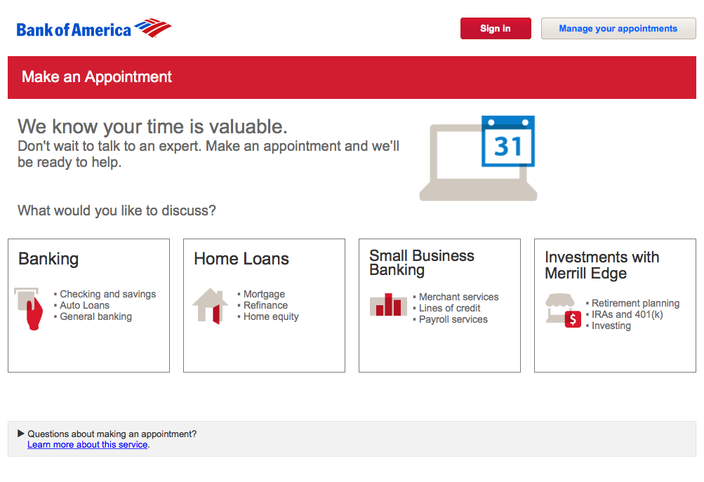
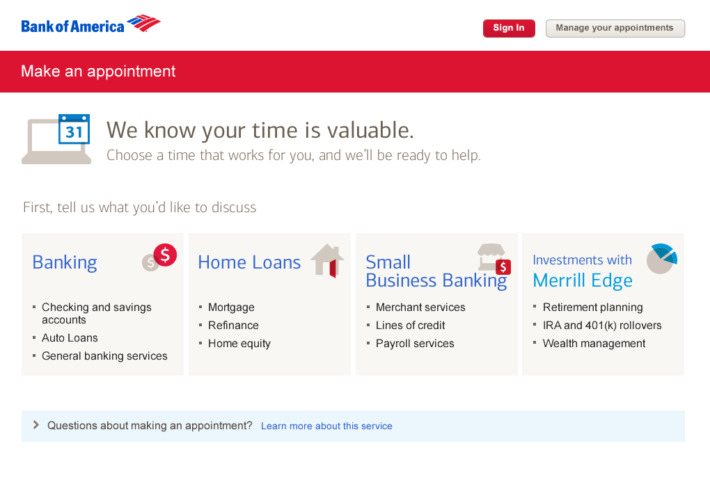
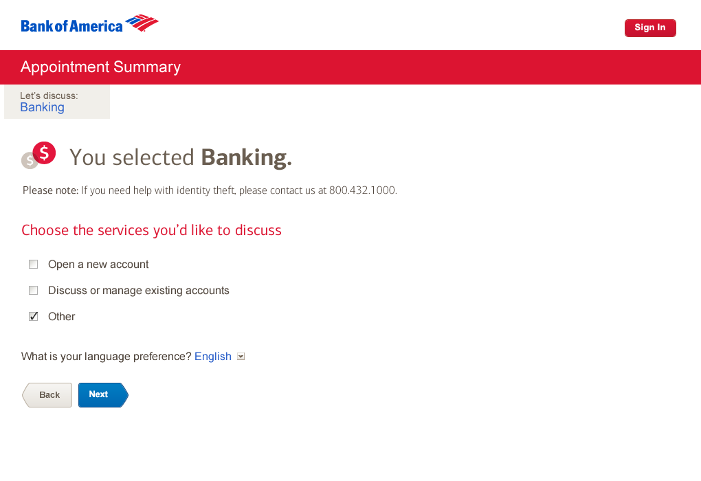
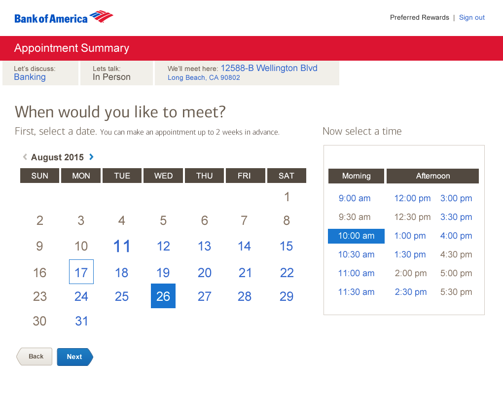
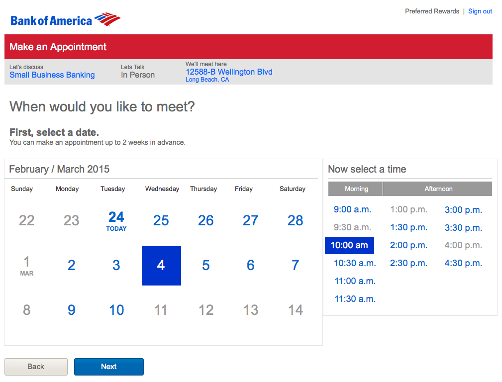
The new interface was a paradigm shift in simplicity and efficiency. We significantly reduced cognitive load, minimized scrolling, and created a visually rich, intuitive flow that made appointment booking a breeze.
Streamlined Interface:
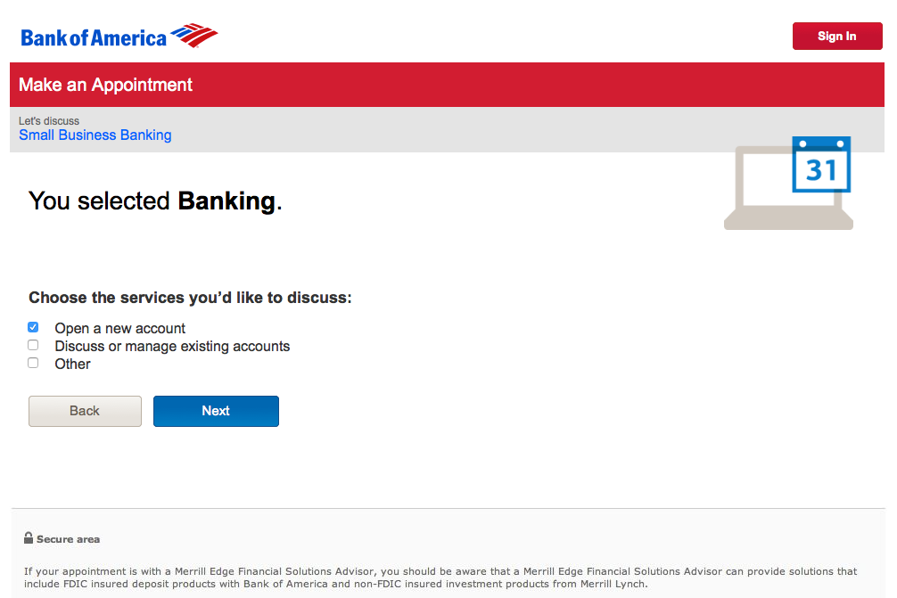
By reducing instructional text, introducing a smart appointment summary bar, and optimizing screen layouts, we created a sense of speed and ease that was previously lacking.
Increased Customer Satisfaction:
The simplified, user-friendly design led to improved adoption rates and higher customer satisfaction scores.
Boosted Sales Performance: By removing the barriers to appointment scheduling, we directly contributed to an uptick in customer engagement and, consequently, sales growth.
This project wasn’t just about redesigning a tool; it was about reimagining how Bank of America connects with its customers. By embracing agile methodologies, leveraging iterative user testing, and focusing relentlessly on user needs, we turned a significant challenge into a remarkable opportunity for innovation. The result was a modern, efficient, and user-centric appointment scheduling system that not only met but exceeded expectations, setting a new standard for digital banking interactions.

