Global Navigation
Modern update for a critical legacy component
Bank of America’s legacy navigation system was outdated, relying on a static tab structure that limited functionality, was not easily adaptable to context and usage, and overwhelmed users. It hindered easy access to important site functions and discouraged exploration and limited sales and marketing opportunities.
Our challenge was to reimagine the navigation system, and to deliver a modern and intuitive experience that facilitated easy exploration, movement and action for customers who expect simple access of their financial data. I developed a dynamic, interactive design solution with modern menu functions and adaptable structures, supported by back-end technology updates, that significantly improved the user experience.
How we Upgraded a Key Tool for Customers’ Financial Lives
Project Challenge
Bank of America has long been an industry leader in fintech, but one challenge of this pioneering legacy was an outdated navigation infrastructure and information architecture. I was tasked with leading the effort to reimagine and rebuild this critical component of our online banking platform and mobile app.
Our objectives were ambitious and multifaceted:
- Reduce customer friction
- Seamlessly surface relevant information
- Develop a flexible structure capable of accommodating diverse customer relationships, account types, and dynamic content delivery.
The new system also needed to be fully accessible, integrate both in-house platforms and vendor-hosted sections, gracefully handle degraded modes, and provide a scalable foundation for the bank’s continued growth.
To tackle this challenge, I drew on an extensive body of prior work, including research insights, competitive analysis, and design vision efforts I had previously led. By leveraging this foundation, my team and I designed a modern, intuitive navigation experience that not only met our goals but continues to serve as a cornerstone of the Bank of America digital experience to this day.
Project Summary
Working from a well-defined future-state vision, I drove the process from concept to production, working with dozens of partners, including product managers, engineers, vendors, and executives. The BofA site is large and the architecture is complex. The system had to be flexible enough to handle disparate customer profiles and dynamic data and navigation components. With over 30 million monthly users and customers’ financial data in the balance, there was a lot at stake.
Research
Long before the project was formally funded, the UX team conducted extensive foundational research including competitive analysis, focus group studies, card sorting, tree association, usability studies, and web surveys. Thanks in large part to this extensive body of qualitative and quantitative research, I was able to assure even skeptical stakeholders of the validity of our new approach.
Socialization / Conceptual Prototype
We were advocating some significant changes to the site IA, giving certain product managers reason to fear change. We conceived a system built with conditional elements and with a new, dynamic UI. It was critical for partners to have a dynamic experience of the new design, so one of the first things I did was build a conceptual prototype (fig. 1, above), which served both as an interactive technical document and an easy-to-use demo. I turned to our data to validate design and IA decisions and leaned on my prototype to show how well it could work


Detailed Design
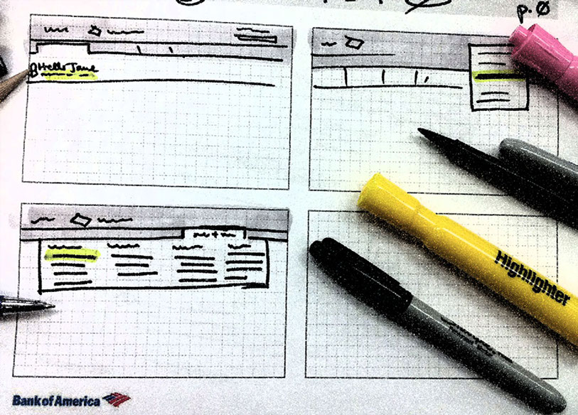
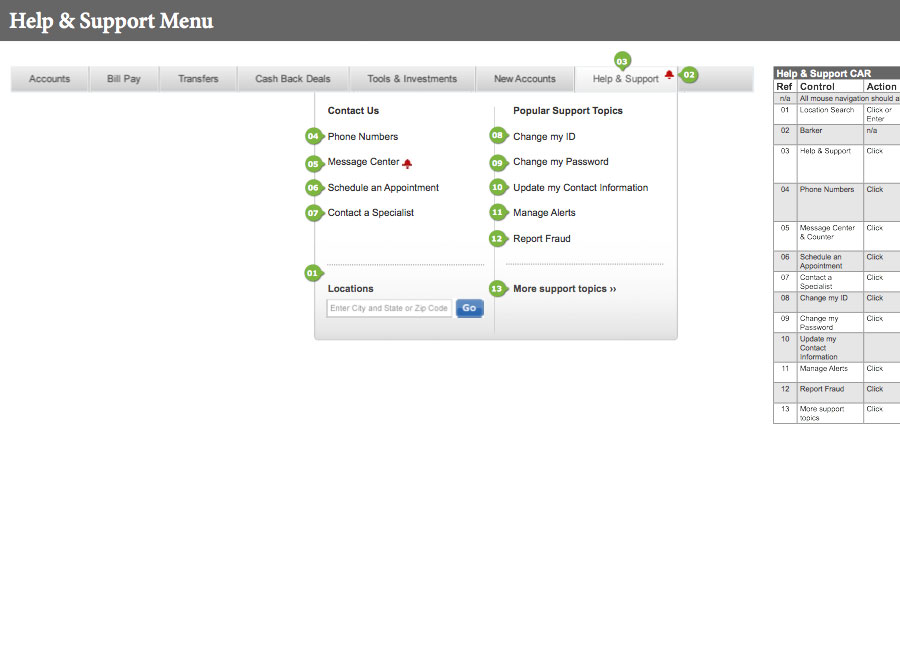
Armed with the conceptual prototype, the UX team spent months working through site inventory, meeting with product and engineering teams to research, evaluate, socialize and validate our design decisions. We met with product managers, internal and vendor tech teams, business and marketing executives, risk & compliance folks, accessibility consultants and, of course, senior UX leadership.
At each meeting, we shared our vision, listened to input, feedback and direction. Through this process, we advanced both the accuracy and detail of our wireframes and built consensus across the organization in support of the new designs.
Navigation Demo
Successful Delivery & Stellar Customer Feedback
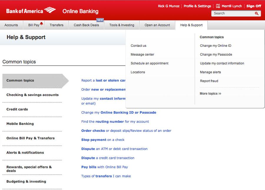
The navigation launched just 9 months after our project started. As of 2024, my design is still the working navigation system in the authenticated BankOfAmeric.com website.
Upon release, the bank received abundant positive reviews and feeback from our customers. Visually modern, functionally intuitive, and technically flexible, my design addressed all the core challenges and opportunites we identified, and built a robust foundation to allow many years of sustained utilization and growth.
Here are a few choice quotes from our customers after the launch.
The new navigation is wonderfully clear and easy on the eyes.
Very pleased, especially about the rollover on the Accounts tab. It was always frustrating from the Bill Pay page not to be able to see the current balance. Now, I can. Thanks!
I really like the integration of the balances in the Accounts menu. Nice touch. Clean UI.
Really excellent and attractive!
